EP1365345A2 - System and methods for visualizing diverse biological relationships - Google Patents
System and methods for visualizing diverse biological relationships Download PDFInfo
- Publication number
- EP1365345A2 EP1365345A2 EP03252901A EP03252901A EP1365345A2 EP 1365345 A2 EP1365345 A2 EP 1365345A2 EP 03252901 A EP03252901 A EP 03252901A EP 03252901 A EP03252901 A EP 03252901A EP 1365345 A2 EP1365345 A2 EP 1365345A2
- Authority
- EP
- European Patent Office
- Prior art keywords
- data
- diagram
- pathway
- story
- experimental
- Prior art date
- Legal status (The legal status is an assumption and is not a legal conclusion. Google has not performed a legal analysis and makes no representation as to the accuracy of the status listed.)
- Withdrawn
Links
Images






Classifications
-
- G—PHYSICS
- G16—INFORMATION AND COMMUNICATION TECHNOLOGY [ICT] SPECIALLY ADAPTED FOR SPECIFIC APPLICATION FIELDS
- G16B—BIOINFORMATICS, i.e. INFORMATION AND COMMUNICATION TECHNOLOGY [ICT] SPECIALLY ADAPTED FOR GENETIC OR PROTEIN-RELATED DATA PROCESSING IN COMPUTATIONAL MOLECULAR BIOLOGY
- G16B45/00—ICT specially adapted for bioinformatics-related data visualisation, e.g. displaying of maps or networks
-
- G—PHYSICS
- G16—INFORMATION AND COMMUNICATION TECHNOLOGY [ICT] SPECIALLY ADAPTED FOR SPECIFIC APPLICATION FIELDS
- G16B—BIOINFORMATICS, i.e. INFORMATION AND COMMUNICATION TECHNOLOGY [ICT] SPECIALLY ADAPTED FOR GENETIC OR PROTEIN-RELATED DATA PROCESSING IN COMPUTATIONAL MOLECULAR BIOLOGY
- G16B50/00—ICT programming tools or database systems specially adapted for bioinformatics
- G16B50/10—Ontologies; Annotations
-
- G—PHYSICS
- G16—INFORMATION AND COMMUNICATION TECHNOLOGY [ICT] SPECIALLY ADAPTED FOR SPECIFIC APPLICATION FIELDS
- G16B—BIOINFORMATICS, i.e. INFORMATION AND COMMUNICATION TECHNOLOGY [ICT] SPECIALLY ADAPTED FOR GENETIC OR PROTEIN-RELATED DATA PROCESSING IN COMPUTATIONAL MOLECULAR BIOLOGY
- G16B50/00—ICT programming tools or database systems specially adapted for bioinformatics
Definitions
- the present invention pertains to a method and system for visualizing biological relationships and to software systems supporting the information synthesis activities of molecular biologists, in particular the activities of organizing, using, and sharing diverse biological information
- biologists In addition to data from their own experiments, biologists also utilize a rich body of available information from internet-based sources, e.g. genomic and proteomic databases, and from the scientific literature. The structure and content of these sources is also rapidly evolving. The software tools used by molecular biologists need to gracefully accommodate new and rapidly changing data types.
- Biologists use this experimental data and other sources of information to piece together interpretations and form hypotheses about biological processes. Such interpretations and hypotheses can be represented by narrative descriptions or visual abstractions such as pathway diagrams. To build interpretations and hypotheses, biologists need to view these diverse data from multiple perspectives. In particular, it is very important to validate the possible interpretations and hypotheses against the detailed, experimental results, in order to test whether the interpretations/hypotheses are supported by the actual data. An example of this would be to validate, test, or illustrate a putative pathway, represented in a pathway diagram, against gene expression data.
- An extensible architecture is provided that enables multiple data types to be overlaid upon multiple kinds of viewers, thus creating an understanding of biological context. This makes it much easier for product developers to incorporate new data types into the product, utilizing existing viewers. Also, it makes it easier for the user to identify correlations, disparities, and other patterns across multiple data types.
- a method of visualizing biological relationships includes providing first and second data sets of different type on a user interface; providing at least one of a pathway diagram, a textual story, or other map or diagram having elements corresponding to at least some of elements in the first and second data sets, on the user interface; correlating elements in the pathway diagram, textual story or other map or diagram with elements in the first and second data sets; mapping the correlated elements from the pathway diagram, textual story or other map or diagram to the corresponding elements in the first and second data sets; and selecting at least a portion of the data from the first data set and overlaying it on the pathway diagram, textual story or other map or diagram, wherein the values of the selected data are inserted into the pathway diagram, textual story or other map or diagram so that a user can compare the selected data values with corresponding hypothetical values existing in the diagram pathway, textual story or other map or diagram.
- the data sets may be selected among various diverse types of data, including, but not limited to gene expression data, protein expression data, gene expression ratios, protein expression ratios, client patient information, Taqman data, cancer types data, breast cancer subtypes data, gene expression data from a microarray, protein abundance data generated by mass spectrometry and protein abundance data generated by gel electrophoresis.
- maps or diagrams that may be employed include, but are not limited to gene expression profile plots, genome maps, chromosome maps, clustered heat maps, and tree views of hierarchical gene expression clusterings.
- a method of visualizing biological relationships includes providing an experimental data set in a viewer on a user interface; providing at least one of a pathway diagram and a textual story on the user interface; correlating elements in the pathway diagram and/or textual story with elements in the experimental data set; mapping the correlated elements from the pathway diagram and/or textual story to the corresponding elements in the experimental data set; and selecting at least a portion of the experimental data and overlaying it on the pathway diagram or textual story, wherein the values of the experimental data are inserted into the pathway diagram and textual story so that a user can compare the experimental data values with corresponding hypothetical values existing in the diagram pathway and/or textual story.
- the method may include iteratively stepping through the entire experimental data set by repeatedly selecting and overlaying successive portions of the experimental data set.
- the method may further highlight elements of the pathway diagram and textual story elements to which the selected and overlayed data has been correlated.
- the elements may be encoded so that different colors designate different activities, for example, proteins in the pathway diagram and textual story corresponding to up-regulated genes may be encoded as red, and proteins corresponding to down-regulated genes may be colored green.
- the elements in the pathway diagram and textual story which do not correspond to the selected and overlayed data may be grayed out or colored gray.
- the encoded values of the overlayed data may be optionally adjusted to accommodate for any and all of data distribution, switching between linear and logarithmic scales, filtering out certain subsets of the data, or changing the visual encoding used.
- a system for visualizing biological relationships from data selected among diverse data types includes means for accessing data sets having diverse data types; means for selecting all or a portion of the data in each said data set; means for overlaying the selected data onto a pathway diagram, textual story or other map or diagram where the overlayed data can be compared; and means for visually displaying the overlayed data for visual comparison by a user.
- a system for visualizing biological relationships from data selected among diverse data types includes means for accessing data sets having diverse data types; and means for correlating the diverse data types across common attributes.
- the means for correlating associates genes in the gene expression data sets with proteins that the respective genes encode, in the protein expression data sets, and means for encoding the correlation in a textual story, pathway diagram, or other map or diagram.
- An interface for a user to manipulate encodings and transitions in overlayed biological data includes an interactive display on a user interface; and means for modifying the functions or thresholds for color encoding of the overlayed data to accommodate different ranges and distributions in the experimental data.
- the interface may further include any of means for converting the overlayed data between linear and logarithmic scales, means for filtering out subsets of the overlayed data, and/or means for changing the visual encoding used.
- a computer readable medium carrying one or more sequences of instructions from a user of a computer system for visualizing biological relationships from data selected among diverse data types, wherein the execution of the one or more sequences of instructions by one or more processors cause the one or more processors to perform the steps of accessing data sets having diverse data types, and correlating the diverse data types across common attributes.
- the computer readable medium may be provided for carrying out the following further steps: providing the data sets in a viewer on a user interface; providing at least one of a pathway diagram, a textual story or other map or diagram on the user interface; correlating elements in the pathway diagram, textual story or other map or diagram with elements in the diverse data types; and mapping the correlated elements from the pathway diagram, textual story or other map or diagram to the corresponding elements in the data sets.
- the computer readable medium may be provided for carrying out the steps of: selecting at least a portion of the data in one of the data sets and overlaying it on the pathway diagram, textual story, or other map or diagram, wherein the values of the selected data are inserted into and displayed on the pathway diagram, textual story or other map or diagram so that a user can compare the selected data values with corresponding hypothetical values existing in the diagram pathway, textual story or other map or diagram.
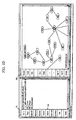
- Fig. 1A shows an example of a main window of the present invention displayed on a graphical user interface (GUI) which includes gene array experimental results.
- GUI graphical user interface
- Fig. 1B shows an example of a main window of the present invention displayed on a graphical user interface (GUI) which includes protein abundance data obtained by mass spectrometry.
- GUI graphical user interface
- Fig. 1C shows an example of a main window of the present invention displayed on a graphical user interface (GUI) which includes gel data indicating protein abundance values.
- GUI graphical user interface
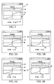
- Fig. 2 shows a user interface that includes interactive controls for performing modifications in the visual appearance of encoding of the data, according to the present invention.
- Figs. 3A-3B illustrate one function of the interface shown in Fig. 2 for modifying the encoding.
- Figs. 4A-4B illustrate another function of the interface shown in Fig. 2 for modifying the encoding.
- FIGs. 5-7 illustrate a flowchart representing a method of using the present invention.
- Fig. 8 is a screen print showing an example of a Genome Map Viewer provided by NCBI.
- Fig. 9 is a screen print showing an example of a Genome Map Viewer provided by UCSD.
- Interpretations/hypotheses which are developed in either story form or diagrammatic form may be dependent upon many different cellular processes, genes, and various expressions of genes with resultant variations in protein abundance. Correlation and testing of data against these hypotheses is becoming increasingly more tedious and lengthy with the increased automation of the ways in which gene and other data is generated (e.g., microarrays, mass spectroscopy. etc.).
- the present invention provides a system, tools and methods for visualizing these correlations of data and hypotheses, through a mechanism called generalized data overlays.
- Fig. 1A shows an example of a main window of the present invention displayed on a graphical user interface (GUI).
- GUI graphical user interface
- gene expression data which is shown in the Results viewer pane 20 can be overlaid upon an interactive pathway diagram 42, such as that shown in the Diagram Editor 40, for example, and over a textual story representation, such as shown in the Story Editor 30, for example.
- the gene expression values are color-encoded, ranging from green (down-regulated gene, e.g., see 22g) to red (up-regulated gene, e.g., see 22r), with black being essentially neutral (i.e., neither up nor down-regulated, e.g., see 22b).
- the present invention provides an extensible, generalized architecture and an application programming interface for building data overlays, as well as software for specific data overlays.
- the present invention facilitates and makes easier the incorporation of new and changing types of biological information and interpretations. For product developers, this means that it is easier to add new data types.
- a new data type is needed by customers, for example protein abundance data from protein microarrays or mass spectrometry
- the product developers can couple the new data with existing visualizations in a way that is much easier than with conventional, data type-specific viewers.
- the present invention further facilitates the building of new and different visualizations (interpretations) for biological information, e.g., pathways, genome maps, biological ontologies, results from data mining or text mining, and the like.
- biological information e.g., pathways, genome maps, biological ontologies, results from data mining or text mining, and the like.
- the present invention makes it easier to find patterns, correlations, and disparities across the different data types, for example, when gene expression data for a gene are inconsistent with the abundance data for the protein it encodes for. Additionally, communication and sharing of information between multiple users, possibly in different geographic, scientific, and/or methodological settings is enhanced. This is especially true for customers in pharmaceutical companies engaged in drug discovery.
- the present invention provides generalized methods for visualizing these correlations of data and hypotheses, through mechanisms called generalized data overlays.
- data overlay data from one view (for example, gene expression data or mass spectrometry data) is encoded (e.g. color coded) and superimposed upon data items in a different view (for example, a story or pathway diagram).
- a story 32 as indicated in the story editor 30 utilizes narrative structure to represent the state of the biologist's hypotheses and understandings.
- Narrative structure provides a framework for organizing information about the interrelationships and biological interactions amongst items (e.g., genes, proteins, sequences, other gene products, etc.) and collections (e.g., groups of related items or information) in biological pathways.
- Biological stories can be thought of as templates for organizing and describing what is going on in the cell.
- a biological story can also be thought of as the representation of a hypothesis and the train of thought that produced that hypothesis. The user can piece together knowledge about a biological phenomenon and compose a biological story by using the story editor component 32 shown in Figs.
- a Story includes three main sections: a Theme, a list of one or more Players, and a set of Explanations.
- the Theme is a brief description of the overall gist of a biological story, such as might appear in the abstract of a journal article.
- the Players are the set of biological entities that play a role in the biological process being described in the Story, for example genes and proteins, or collections of genes and/or proteins.
- An Explanation can include one or more Interactions, basically steps in the process that is being described; for example, "PAX3-FKHR induces MY14".
- Different hypotheses can be represented by Alternatives, which specify different sets of possible Interactions. This is often useful in formative stages of an investigation, where there may be several plausible explanations for a particular biological phenomenon.
- the biologist can document the reasoning behind Theme, Explanation, Interaction, and/or Alternative story elements via Support and Oppose story elements.
- the biologist can use a Support element to provide a citation from the literature that provides supportive evidence for the claims made in the Alternative.
- the biologist can use an Oppose story element to provide a citation from the literature that provides evidence that disputes a claim.
- the Story Editor component 30 is a syntax-directed editor in which a biological story is represented by a tree structure. In this way, it is like an "outline processor".
- the tree appears on a canvas on the right side of the Story Editor component 32. Descriptions of biological phenomena are added to this tree, with nodes that correspond to the elements of narrative structure, i.e. Players, Explanations, etc.
- On the left side of the Story Editor component 30 is a set of buttons 34, which are used for adding nodes to (or deleting nodes from) the tree. Story nodes can be added to and deleted from the tree and textual descriptions can be added to story nodes in the tree.
- Textual descriptions can be to any node by either editing the node's label in place or by invoking an ObjectEditor interface that provides for detailed annotation of any node (again, see commonly owned, co-pending U.S. Application Serial No. 09/863115).
- Each story node represents an element of narrative structure: for example, a Player, Explanation or Interaction.
- a story node can be added by pressing a button 34 in the Story Editor component 30, for example pressing the Player button to add a Player.
- a button 34 in the Story Editor component 30 for example pressing the Player button to add a Player.
- the buttons representing the valid story nodes that can be nested below it are enabled, whereas the non-valid story nodes are disabled (grayed out).
- the user typically starts building up a biological story by specifying the Players in the story.
- an existing story may be imported into the present system and displayed in the Story Editor 30.
- the Players in a biological story can be either items or collections.
- Players may be added to a story by dragging and dropping (or cutting/copying and pasting) them from the Results viewer 20 and/or the Collection Manager 10, for example, when a story is being built or modified.
- Players can also be added by pressing the Player button 34 and then adding descriptive text to the node, as described above.
- the "plot" of a biological story represents a sequence or set of Explanations, which in turn contain a sequence or set of Interactions.
- the biologist creates Explanations by selecting the Explanation button in the Story Editor component 30, which causes an Explanation node to be added to the biological story.
- the investigator then enters a textual description of the biological Explanation by either editing the node's label in place or by invoking an ObjectEditor interface that provides for detailed annotation of any node.
- the biologist creates Interactions by selecting the Interaction button in the Story Editor component 30, which causes an Interaction node to be added to the biological story.
- the investigator then enters a textual description of the biological Interaction by either editing the node's label in place or by invoking an ObjectEditor interface that provides for detailed annotation of any node.
- the user can add a Support node to a Theme, Explanation, Player, Alternative, or Interaction by selecting the Support button (shown in Figs. 1A-1C), and inputting that information under the appropriate node. Similarly, information that contradicts a hypothesis may be tracked. This is done by adding an Oppose node in the same manner as described above with regard to a Support node, except that the Oppose button is selected to accomplish this task.
- Textual information may be added to the Support and/or Oppose node by either editing the node's label in place or by invoking an ObjectEditor interface that provides for detailed annotation of any node.
- Database and literature citations may be added to the Support and/or Oppose nodes by dragging and dropping a URL from a Web page onto a Support or Oppose node, or onto the ObjectEditor interface for that node.
- a biological pathway 42 may be constructed using the Diagram Editor 40.
- a biological pathway is a common way of representing a biological story pictorially.
- the present invention uses the Diagram Editor 40 to build or import a graphical analog of a biological story.
- An analogy can be drawn here to Computer-Aided Circuit Design (CAD) software, particularly to CAD schematic capture tools, in that the Diagram Editor 40 is used to sketch out a representation of the "circuitry" of a biological pathway.
- CAD Computer-Aided Circuit Design
- the Diagram Editor 40 includes a canvas on the right and a set of buttons on the left for adding elements.
- Biological entities e.g., items, collections, etc.
- relationships e.g., events
- the pathway 42 can be built up by dragging/dropping items and/or collections onto the Diagram Editor panel when building a biological pathway 42.
- a graphical icon e.g., see 44a, 44b, and 44c
- representing the item or collection appears at the drop point.
- There are a set of pre-defined "verbs” which are used to specify a relationship between "nouns", for example Inhibits, Promotes, or BindsTo.
- Two “nouns” are connected with a "verb” by selecting the "verb” on the menu (e.g. by pressing a button 46 labeled Promote, Inhibit, or Bind), then drawing a line between the two graphical icons representing the "nouns.” Drawing is accomplished by selecting the source node by clicking on it, pressing down on the mouse button for a "verb”, dragging the mouse sprite over to the second item, then releasing the mouse button. A color-encoded arrow appears, connecting the two graphic icons, for example a red line represents the Inhibits "verb.”
- "Verbs" in the Diagram Editor 40 are directional; that is, a red arrow running from item 44a to item 44b indicates that "a Inhibits b," but not the converse.
- the present invention links the components of the Story Editor 30 and the Diagram Editor 40, so that any time an update is made to the Story in the Story Editor, the same change will be simultaneously made to any biological pathway in the Diagram Editor 40 in which that component is represented. That is, changes made to the underlying biological object referenced by a story node will be reflected in any diagram editor element that references that underlying biological object.
- the items 22 in the Results viewer 20 represent values from thousands of probes in a heat map produced by a microarray where, for example, test samples may be compared with references samples (e.g., diseased tissue versus "normal" tissue) under various conditions. Dye is mixed with the samples and they are hybridized to produce color-encoded results. Probes that are colored red indicate an up-regulation of the gene, those that are colored green indicate a down-regulation of the gene, and a black color represents neutral, i.e., substantially no up or down regulation. Various shades and intensities of green and red result, which indicate the relative degree of up or down regulation of any particular probe.
- row 313 may knock out "gene A” to see how it effects the rest of the genes in the experiment, while row pf.. knocks out “geneB” and leaves “gene A” in the experiment, and so forth.
- row pf.. knocks out "geneB” and leaves “gene A” in the experiment, and so forth.
- any column can be selected to overlay the values of that column onto the pathway in the Diagram Editor 40 and/or Story Editor 30.
- the 313 column has been selected as noted by the icon next to the column label "313".
- any genes represented in that column are matched up with their representations in the pathway diagram 42 and the Story.
- a visual representation of this overlay is displayed, wherein the overlayed data shows up in its representative color on each of the icons in the pathway diagram as well as in the Story. This holds true for each icon in the pathway diagram that references an item in the experimental data, as well as each Player node in the StoryEditor that references an item in the experimental data.
- a range of colors is mapped to a range of values in the data. Items that are correlated will have similar color schemes whereas items that are disparate or outliers would have different color schemes.
- the system may optionally identify the discrepancy by flashing the particular icon for which the disparity exists and/or sounding an audible alarm and/or displaying a text message, any and all of which alert the user to the discrepancy. This then provides the user the opportunity to closely review the values of the items involved, and to make proper annotation of the discrepancy, such as by entering an "Oppose" node as described above, for example.
- the ability to make and store such annotations is very valuable particularly in sharing information with other users working on the same pathway.
- the user can repeat this process, a column at a time from the array values 22, thereby stepping through all of the data resultant from the microarray experiments and analyzing each column in the same manner to verify correlating data and annotate discrepancies and outliers, by visualizing the expression levels, color-coded on top of the icons for those items in the Diagram Editor and/or Story Editer.
- Such "simulations" can be useful, for example, in inferring relationships between items, such as causal relationships inferred by stepping through time course data.
- the present invention is capable of performing overlays of data from other diverse sources as well.
- mass spectrometry data is displayed in section 24 of the Results viewer which is indicative of relative protein abundance resultant from particular gene studies.
- This data 24 can also be overlayed on the pathway diagram 42 in Diagram Editor 40 or on the Players of the Story 32 in the Story Editor 30, at which time the overlayed data shows up in its representative color on each of the icons in the pathway diagram as well as in the Story which display the appropriate protein abundance values. Assuming that all of the overlayed values are within a predefined acceptable normal range about each of the values already contained in the Story and pathway diagram, the user can verify this visually by noting essentially similar color values.
- this step is also useful in identifying disparities, outliers, and other surprises in the data.
- the system may identify the discrepancy by flashing and/or enlarging the particular icon for which the disparity exists and/or sounding an audible alarm and/or displaying a text message, any and all of which alert the user to the discrepancy. This then provides the user the opportunity to closely review the values of the items involved, and to make proper annotation of the discrepancy, such as by entering an "Oppose" node as described above, for example.
- the ability to make and store such annotations is very valuable particularly in sharing information with other users working on the same pathway.
- overlays on the Diagram Editor 40 can also serve to support or oppose interactions shown on the Diagram Editor 40. This can be especially useful for alerting a user to inconsistencies, such as where the expression levels of two nodes (e.g., two nouns) connected by an interaction (e.g., verb) do not coincide with the meaning of that interaction.
- an interaction e.g., verb
- the Diagram Editor 40 contains nodes for "gene A” and "gene B” and contains an interaction indicating that "gene A promotes gene B”
- the present invention highlights the interaction, or otherwise alters it so as to indicate that there is an inconsistency.
- the arrow from gene A to gene B i.e., interaction
- could be changed in style e.g., from a solid line to a dashed line
- changed in thickness e.g., flashed, blinked or changed in color.
- the user can repeat this process, a column at a time when multiple columns of protein abundance data are present, much in the same manner that the columns of array data were treated.
- the present invention similarly allows overlay of gel data 26 representing protein abundance, as shown in Fig. 1C.
- the present invention may also use additional viewers to provide visual overlay data in additional formats. For example, a red or green band may be overlayed on a chromosome map indicating the relative position on the chromosome of the gene that the color represents.
- the present invention includes a user interface that allows the user to adjust the encodings of the data to change from the ratio scale to the log scale and vice versa, as well as to change the color spectrum of a column or an entire array, to give a more distinguishable color variation among the representative values.
- Fig. 2 shows a user interface 50 that includes interactive controls for performing the modifications in the visual appearance of encoding of the data as described above.
- a virtual toggle switch 52 is provided to easily allow the user to convert the data back and forth between the ratio format and the natural log format by simply selecting above the desired format with the mouse or cursor and pressing enter. In the view shown, the ratio format has been selected.
- a data distribution adjuster 54 is provided above the virtual toggle switch 52 .
- the data distribution adjuster provides a graphical representation of the distribution of the data selected, whether it be a column of an array, column of gel data, mass spectrometry data, or the like, or an entire array of data.
- the data curve 56 shown is representative of the data values of the population of the data selected.
- the data curve 56 illustrates the points along the function used to color encode the data values.
- Data points are mapped to color points along the curve.
- a well distributed population of data is represented, resulting in a full use of the range of the vertical color scale.
- the vertical color scale runs from +1 at the top of the scale to 0 at the bottom of the scale.
- the actual data values encoded by the color scale can be any positive or negative floating point number.
- the horizontal scale theoretically runs from - ⁇ to + ⁇ to include all of the data points selected. If the data curve were flatter, it could be advantageous to adjust the steepness of the curve to take full advantage of the color distribution. This can be accomplished, for example, with the slider 58 at the top of the screen, whereby sliding the selector switch to the left relatively flattens the S-curve, while sliding the selector to the right makes the curve steeper. Switching from the ratio scale to the log scale will redefine the curve to reflect the log values resultant from the converted ratio values.
- a data curve 56 is shown which has a sufficiently steep curve to enable a reasonable distribution over the color spectrum, but a disproportionate number of the data values are in the red part of the spectrum. This is most easily ascertained by viewing the results viewer 20 which will show a predominant number of red data points with little to no green points displayed. In such a case, the user can drag and drop on the vertical axis 56v and move it to the right, as shown in Fig. 3B. By repositioning the vertical axis 56v, this also reconfigures the midpoint of range of data values defining the divider between green and red coloration, resulting in a relatively larger number of green data points, to aid in visually differentiating the data. By the same token, a shifting of the vertical axis to the left would produce more red data points, relatively speaking, in examples where this is helpful.
- Fig. 4A shows an example where the midpoint of the curve is fairly well-placed but the distribution of green data points is fairly close to neutral (i.e. close to gray or black).
- the cursor or mouse can be used to drag and drop the horizontal axis 46h to place the left side of the curve more into the green spectrum for easier visual identification of the green data points, as shown in Fig. 4B.
- a shifting of the horizontal axis 46h downwardly would place the red data points more into the red end of the spectrum.
- a flowchart representing a method of using the present invention is illustrated.
- the user first wants to import an existing pathway from a database and step through overlays of a number of gene expression data sets. While doing this, the user can also see the overlays of data upon a textual Story 32 that the user has developed which describes the user's current hypotheses about what is going on in the living cell.
- the user next wants to step through overlays of protein data related to the pathway (e.g. as derived from mass spectrometry).
- the user wants to look at these data from another perspective, for example overlaying them on a genome map.
- Specific examples that embody such a usage may include any or all of: gene expression and protein expression ratios simultaneously overlayed upon pathway diagrams; clinical patient information encoded on gene expression profile plots; TaqMan data overlayed upon a textual story hierarchy; cancer types overlayed upon a clustered heat map; and breast cancer subtypes overlayed upon a tree view of hierarchical gene expression clustering.
- the user imports an experimental data set into the Results viewer 20.
- the experimental data set can come from a database (or flat file) of gene expression data.
- the data represents a number of experiments on different samples using a particular DNA microarray.
- Each row represents a specific biological entity, in this case a gene (more specifically, the rows represent measurements of gene expression ratios for microarray probes that represent gene sequences).
- the columns represent the data from different experiments run for the genes.
- step S2 the user imports an existing pathway into the Diagram Editor 40.
- This pathway could come from an accessible pathway database, such as BIND DB, or might have been constructed by the user in the Diagram Editor, as mentioned above.
- the system utilizes an XML-based markup language, such as PathML, to layout the diagram from the imported pathway data.
- the user can extend the pathway diagram in step S3 by dragging a row in the Results viewer 20 into the Diagram Editor 40.
- the Diagram Editor 40 provides a library of connection primitives to enable the user to connect the new elements into the pathway diagram. These primitives represent relationships between the biological entities in the pathway diagram, such as "promotes”, “inhibits”, “binds” (which are also available via the buttons 46 for manual construction by the user, as described above), and are shown as lines and arrows.
- the user can add a textual description of the hypotheses about what is going on in the cell. This could be done via the Story Editor component 30.
- the system correlates the elements in the Diagram Editor 40 and the Story Editor 30 with specific rows in the gene expression data in step S4.
- the task here is to correlate genes in the Results Viewer 20 with the proteins they encode in the pathway.
- the system next maps the encodings to the data in Results Viewer 20 in step S5.
- a simple case might involve mapping the gene expression data values to a color map running from green to red, as are seen in "heat map" diagrams of gene expression data.
- the system takes into account the distribution of the data values, so that the range of data is mapped to fit with the range of encodings available, e.g., to accommodate for outliers and wide dynamic range. The system can then present to the user the results of this mapping in the Results Viewer 20.
- step S6 the user selects a column in Results Viewer 20 to begin stepping through the data overlays.
- step S7 the system maps the column's values to elements in the pathway diagram 42 contained in the Diagram Editor 40 and in the Story Editor 30, and highlights the appropriate pathway and story elements accordingly.
- proteins corresponding to up-regulated genes are encoded as red, and proteins corresponding to down-regulated genes are colored green. Proteins corresponding to genes with normal regulation are colored black. Elements in the pathway diagram or story which do not correspond to specific rows in the Results Viewer 20 are colored gray.
- the User can adjust the encodings in step S8, via the user interface 50 described above, provided for this purpose.
- This could be used, for example, to accommodate for data distribution, to switch between linear and logarithmic scales, to filter out certain subsets of the data, or to change the visual encoding used, e.g. from color coding to stipple patterns.
- the user iterates through steps S6-S8 (see step S9), as needed, to step through other experiments in the Results Viewer 20.
- the user can import another experimental data set into a second Results Viewer 20, at step S10.
- the data is related to protein abundance data derived from mass spectrometry.
- the system correlates elements and map encodings of the new data at steps S1 and S12, as in steps S4 and S5 above.
- the user selects a column in the second Results Viewer 20 to begin stepping through the data overlays, see step S13.
- step S14 the system maps the column's values to elements in the Diagram Editor 40 and Story Editor 30, and highlights the appropriate pathway and story elements accordingly, in the manner describe above with regard to step S7.
- the user is again given the option to adjust encodings in step S15, using the user interface 50.
- the user then iterates through steps S13-S15, as needed, to step through other experiments in the second Results Viewer 20.
- the user can also select a column or columns in the initial gene expression experiments Results Viewer 20, and the System will map values and highlight elements in the Story Editor 30 and Diagram Editor 40.
- the user may bring up an additional viewer in step S17, in this example a Genome Map Viewer 60 (such as genome map viewers at http://ncbi.nlm.nih.gov or at http://genome.ucsd.edu, examples of which are shown in Figs.8 and 9, respectively, or the like).
- a Genome Map Viewer 60 such as genome map viewers at http://ncbi.nlm.nih.gov or at http://genome.ucsd.edu, examples of which are shown in Figs.8 and 9, respectively, or the like.
- Other types of viewers such as TreeMaps (a space-filling hierarchical data browser), parallel coordinates (a visualization for multidimensional information), etc. may be employed similarly.
- the system correlates the elements in the Genome Map Viewer with specific rows in the gene expression and protein abundance data in step S18, and maps encodings of the same in step S 19, in a manner as described with regard to steps S4 and S5 above.
- the user selects a column in the first or second Results Viewer at step S20 to begin stepping through the data overlays.
- the system maps the column's values to elements in the Diagram Editor, Story Editor and Genome Map Viewer, and highlights the appropriate pathway and story elements accordingly at Step S20, in the manner described above with regard to step S14.
- the user has the option of adjusting encodings using the user interface 50, as described above. The user iterates through steps S2-S22, as needed, to step through other experiments in either of the two Results Viewers.
- Figs. 5-7 has been as a linear sequence of steps, the usage in practice is much more exploratory. For example; the user might be jumping around from step to step, rather than following a linear sequence of steps.
- An important aspect of the present invention is that it is generalized, so that the user can step through multiple types of data and use multiple kinds of viewers.
- the user could overlay the gene expression data on a genome map viewer.
- the user could map protein abundance or protein-protein interaction data upon a pathway viewer or genome viewer.
- the user can identify disparities between data of different types, e.g. by highlighting proteins in the pathway diagram where the gene expression and protein abundance data are inconsistent. This can infer the existence of additional biological phenomena, such as post-transcriptional or post-translational modifications.
Landscapes
- Physics & Mathematics (AREA)
- Life Sciences & Earth Sciences (AREA)
- Engineering & Computer Science (AREA)
- Health & Medical Sciences (AREA)
- Medical Informatics (AREA)
- General Health & Medical Sciences (AREA)
- Theoretical Computer Science (AREA)
- Bioinformatics & Cheminformatics (AREA)
- Bioinformatics & Computational Biology (AREA)
- Biotechnology (AREA)
- Evolutionary Biology (AREA)
- Biophysics (AREA)
- Spectroscopy & Molecular Physics (AREA)
- Bioethics (AREA)
- Databases & Information Systems (AREA)
- Data Mining & Analysis (AREA)
- Information Retrieval, Db Structures And Fs Structures Therefor (AREA)
- Management, Administration, Business Operations System, And Electronic Commerce (AREA)
- Medicines That Contain Protein Lipid Enzymes And Other Medicines (AREA)
Abstract
Description
Claims (14)
- A method of visualizing biological relationships, the method comprising the steps of:providing an experimental data set in a viewer (20) on a user interface (S1);providing at least one of a pathway diagram (S2) and a textual story on the user interface;correlating elements (S4, S11, S18) in the pathway diagram and/or textual story with elements in the experimental data set;mapping (S5, S12, S19) the correlated elements from the pathway diagram and/or textual story to the corresponding elements in the experimental data set;selecting at least a portion of the experimental data and overlaying it on the pathway diagram or textual story, wherein the values of the experimental data are inserted into the pathway diagram and textual story so that a user can compare the experimental data values with corresponding hypothetical values existing in the diagram pathway and/or textual story.
- The method of claim 1, wherein the experimental data set comprises gene expression data from a microarray, protein abundance data generated by mass spectrometry, protein abundance data generated by gel electrophoresis, or Taqman data.
- The method of claim 1 or claim 2, further comprising iteratively stepping (S9, S16, S23) through the entire experimental data set by repeatedly selecting and overlaying successive portions of the experimental data set.
- The method of any of claims 1-3, wherein said selecting comprises selecting a column (S6, S13, S20) of data in the experimental data set.
- The method of any of claims 1-4, further comprising highlighting elements (S7, S14, S21) of the pathway diagram and textual story elements to which the selected and overlayed data has been correlated, wherein proteins in the pathway diagram and textual story corresponding to up-regulated genes are encoded in a first color, and proteins corresponding to down-regulated genes are encoded in a second color that is visually distinct from said first color.
- The method of any of claims 3-5, further comprising adjusting encoded values (S8, S15, S22) of the overlayed data, wherein said adjusting step comprises adjusting to accommodate for data distribution, adjusting to switch between linear and logarithmic scales, adjusting to filter out certain subsets of the data, or adjusting to change the visual encoding used.
- The method of claim 6, wherein any adjustment of encoded values performed with regard to the pathway diagram is automatically also performed on the textual story and vice versa.
- The method of any of claims 1-7, wherein the experimental data set comprises gene expression data, the method further comprising the steps of:providing an experimental protein abundance data set in a second viewer (20) on the user interface;correlating (S18) elements in the pathway diagram and/or textual story with elements in the experimental protein abundance data set, whereby elements in the gene expression data set are thereby also correlated with elements in the experimental protein abundance data set;mapping (S19) the correlated elements from the pathway diagram and/or textual story to the corresponding elements in the experimental protein abundance data set;selecting (S20) at least a portion of the experimental protein abundance data and overlaying it on the pathway diagram or textual story, wherein the values of the experimental protein abundance data are inserted into the pathway diagram and textual story so that a user can compare the experimental protein abundance data values with corresponding hypothetical values existing in the diagram pathway and/or textual story.
- The method of claim 8, wherein at least a portion of the experimental gene expression data set and at least a portion of the experimental protein abundance data set are simultaneously overlaid upon the pathway diagram.
- The method of claim 8 or claim 9, further comprising the steps of:providing a third viewer (20) with a biological map upon which to overlay experimental data;correlating elements (S18) in the biological map with corresponding elements in the gene expression and protein abundance data sets;mapping (S19) the correlated elements from the biological map to the corresponding elements in the experimental protein abundance data set and experimental gene expression data set;selecting (S20) at least a portion of the experimental data in the gene expression data set or the protein abundance data set and overlaying it on the pathway diagram, textual story or biological map, wherein the overlay is also automatically performed on the pathway diagram, textual story and/or biological map at the same time; wherein the values of the selected experimental data are inserted into each of the pathway diagram, the textual story and the biological map, so that the user can compare the experimental protein abundance data values with corresponding hypothetical values existing in the diagram pathway, textual story and/or biological map.
- A system for visualizing biological relationships from data selected among diverse data types, said system comprising:means for accessing (20, 30, 40) data sets having diverse data types;means for selecting all or a portion of the data in each said data set; andmeans for overlaying the selected data onto a pathway diagram, textual story or other map or diagram where the overlayed data can be compared; andmeans for visually displaying the overlayed data for visual comparison by a user.
- A computer readable medium carrying one or more sequences of instructions from a user of a computer system for visualizing biological relationships from data selected among diverse data types, wherein the execution of the one or more sequences of instructions by one or more processors cause the one or more processors to perform the steps of:accessing data sets (S1, S2) having diverse data types; andcorrelating (S4) the diverse data types across common attributes.
- The computer readable medium of claim 12, wherein the following further steps are performed:providing the data sets in a viewer (20) on a user interface;providing at least one of a pathway diagram, a textual story or other map or diagram on the user interface (30, 40);correlating (S4) elements in the pathway diagram, textual story or other map or diagram with elements in the diverse data types; andmapping (S5) the correlated elements from the pathway diagram, textual story or other map or diagram to the corresponding elements in the data sets.
- The computer readable medium of claim 13, wherein the following further steps are performed:selecting at least a portion of the data in one of the data sets and overlaying it on the pathway diagram, textual story, or other map or diagram, wherein the values of the selected data are inserted into and displayed on the pathway diagram, textual story or other map or diagram so that a user can compare the selected data values with corresponding hypothetical values existing in the diagram pathway, textual story or other map or diagram.
Applications Claiming Priority (2)
| Application Number | Priority Date | Filing Date | Title |
|---|---|---|---|
| US155616 | 1993-11-19 | ||
| US10/155,616 US20030218634A1 (en) | 2002-05-22 | 2002-05-22 | System and methods for visualizing diverse biological relationships |
Publications (2)
| Publication Number | Publication Date |
|---|---|
| EP1365345A2 true EP1365345A2 (en) | 2003-11-26 |
| EP1365345A3 EP1365345A3 (en) | 2006-01-25 |
Family
ID=29400586
Family Applications (1)
| Application Number | Title | Priority Date | Filing Date |
|---|---|---|---|
| EP03252901A Withdrawn EP1365345A3 (en) | 2002-05-22 | 2003-05-09 | System and methods for visualizing diverse biological relationships |
Country Status (2)
| Country | Link |
|---|---|
| US (1) | US20030218634A1 (en) |
| EP (1) | EP1365345A3 (en) |
Cited By (1)
| Publication number | Priority date | Publication date | Assignee | Title |
|---|---|---|---|---|
| US7729523B2 (en) | 2004-12-21 | 2010-06-01 | General Electric Company | Method and system for viewing image data |
Families Citing this family (40)
| Publication number | Priority date | Publication date | Assignee | Title |
|---|---|---|---|---|
| US20040049354A1 (en) * | 2002-04-26 | 2004-03-11 | Affymetrix, Inc. | Method, system and computer software providing a genomic web portal for functional analysis of alternative splice variants |
| US20040126840A1 (en) * | 2002-12-23 | 2004-07-01 | Affymetrix, Inc. | Method, system and computer software for providing genomic ontological data |
| US20050197783A1 (en) * | 2004-03-04 | 2005-09-08 | Kuchinsky Allan J. | Methods and systems for extension, exploration, refinement, and analysis of biological networks |
| JP3861780B2 (en) * | 2002-09-13 | 2006-12-20 | 富士通株式会社 | CAD generation management system and generation management program |
| US20060015291A1 (en) * | 2002-10-18 | 2006-01-19 | Leland Stanford Junior University | Methods and systems for data analysis |
| US20050114398A1 (en) * | 2003-10-10 | 2005-05-26 | Jubilant Biosys Limited | Computer-aided visualization and analysis system for signaling and metabolic pathways |
| WO2005096207A1 (en) * | 2004-03-30 | 2005-10-13 | Shigeo Ihara | Document information processing system |
| US7496593B2 (en) | 2004-09-03 | 2009-02-24 | Biowisdom Limited | Creating a multi-relational ontology having a predetermined structure |
| US20060053173A1 (en) * | 2004-09-03 | 2006-03-09 | Biowisdom Limited | System and method for support of chemical data within multi-relational ontologies |
| US7493333B2 (en) | 2004-09-03 | 2009-02-17 | Biowisdom Limited | System and method for parsing and/or exporting data from one or more multi-relational ontologies |
| US20060053171A1 (en) * | 2004-09-03 | 2006-03-09 | Biowisdom Limited | System and method for curating one or more multi-relational ontologies |
| US7505989B2 (en) | 2004-09-03 | 2009-03-17 | Biowisdom Limited | System and method for creating customized ontologies |
| CA2500573A1 (en) * | 2005-03-14 | 2006-09-14 | Oculus Info Inc. | Advances in nspace - system and method for information analysis |
| US8698844B1 (en) * | 2005-04-16 | 2014-04-15 | Apple Inc. | Processing cursor movements in a graphical user interface of a multimedia application |
| US7298370B1 (en) * | 2005-04-16 | 2007-11-20 | Apple Inc. | Depth ordering of planes and displaying interconnects having an appearance indicating data characteristics |
| US7880738B2 (en) * | 2005-07-14 | 2011-02-01 | Molsoft Llc | Structured documents and systems, methods and computer programs for creating, producing and displaying three dimensional objects and other related information in those structured documents |
| US20070263010A1 (en) * | 2006-05-15 | 2007-11-15 | Microsoft Corporation | Large-scale visualization techniques |
| US20080256066A1 (en) * | 2007-04-10 | 2008-10-16 | Tikatok Inc. | Book creation systems and methods |
| US20090138279A1 (en) * | 2007-11-23 | 2009-05-28 | General Electric Company | Systems, methods and apparatus for analysis and visualization of metadata information |
| ES2763537T3 (en) * | 2008-09-16 | 2020-05-29 | Beckman Coulter Inc | Interactive tree diagram for flow cytometric data |
| AU2009295853A1 (en) * | 2008-09-26 | 2010-04-01 | Dymo | Label printer |
| GB0817702D0 (en) | 2008-09-26 | 2008-11-05 | Dymo Nv | Label printer |
| US8463743B2 (en) * | 2009-02-17 | 2013-06-11 | Microsoft Corporation | Shared composite data representations and interfaces |
| US8738584B2 (en) * | 2009-02-17 | 2014-05-27 | Microsoft Corporation | Context-aware management of shared composite data |
| US9035949B1 (en) * | 2009-12-21 | 2015-05-19 | Lucasfilm Entertainment Company Ltd. | Visually representing a composite graph of image functions |
| US8943442B1 (en) | 2009-12-21 | 2015-01-27 | Lucasfilm Entertainment Company Ltd. | Controlling operations for execution |
| EP2740026A4 (en) * | 2011-08-03 | 2015-06-24 | Ingenuity Systems Inc | Methods and systems for biological data analysis |
| WO2013150420A2 (en) * | 2012-04-02 | 2013-10-10 | Koninklijke Philips N.V. | Pathway visualization for clinical decision support |
| WO2015093120A1 (en) | 2013-12-19 | 2015-06-25 | 三菱電機株式会社 | Graph generation device, graph display device, graph generation program, and graph display program |
| US10380226B1 (en) * | 2014-09-16 | 2019-08-13 | Amazon Technologies, Inc. | Digital content excerpt identification |
| US10891320B1 (en) | 2014-09-16 | 2021-01-12 | Amazon Technologies, Inc. | Digital content excerpt identification |
| US10319573B2 (en) | 2017-01-26 | 2019-06-11 | Protein Metrics Inc. | Methods and apparatuses for determining the intact mass of large molecules from mass spectrographic data |
| US10546736B2 (en) | 2017-08-01 | 2020-01-28 | Protein Metrics Inc. | Interactive analysis of mass spectrometry data including peak selection and dynamic labeling |
| US12400846B2 (en) | 2017-08-01 | 2025-08-26 | Protein Metrics, Llc | Interactive analysis of mass spectrometry data including peak selection and dynamic labeling |
| US11626274B2 (en) | 2017-08-01 | 2023-04-11 | Protein Metrics, Llc | Interactive analysis of mass spectrometry data including peak selection and dynamic labeling |
| US12224169B2 (en) | 2017-09-29 | 2025-02-11 | Protein Metrics, Llc | Interactive analysis of mass spectrometry data |
| US10510521B2 (en) | 2017-09-29 | 2019-12-17 | Protein Metrics Inc. | Interactive analysis of mass spectrometry data |
| US11640901B2 (en) | 2018-09-05 | 2023-05-02 | Protein Metrics, Llc | Methods and apparatuses for deconvolution of mass spectrometry data |
| US11346844B2 (en) | 2019-04-26 | 2022-05-31 | Protein Metrics Inc. | Intact mass reconstruction from peptide level data and facilitated comparison with experimental intact observation |
| WO2022047368A1 (en) | 2020-08-31 | 2022-03-03 | Protein Metrics Inc. | Data compression for multidimensional time series data |
Family Cites Families (14)
| Publication number | Priority date | Publication date | Assignee | Title |
|---|---|---|---|---|
| US4383994A (en) * | 1982-01-19 | 1983-05-17 | Mccully Kilmer S | Homocysteine thiolactone salts and use thereof as anti-neoplastic agents |
| US5826260A (en) * | 1995-12-11 | 1998-10-20 | International Business Machines Corporation | Information retrieval system and method for displaying and ordering information based on query element contribution |
| US5812134A (en) * | 1996-03-28 | 1998-09-22 | Critical Thought, Inc. | User interface navigational system & method for interactive representation of information contained within a database |
| US5793970A (en) * | 1996-07-11 | 1998-08-11 | Microsoft Corporation | Method and computer program product for converting message identification codes using a conversion map accesible via a data link |
| US6185561B1 (en) * | 1998-09-17 | 2001-02-06 | Affymetrix, Inc. | Method and apparatus for providing and expression data mining database |
| US6496832B2 (en) * | 1998-10-20 | 2002-12-17 | University Of Minnesota | Visualization spreadsheet |
| US6453241B1 (en) * | 1998-12-23 | 2002-09-17 | Rosetta Inpharmatics, Inc. | Method and system for analyzing biological response signal data |
| US20020067358A1 (en) * | 2000-01-21 | 2002-06-06 | Georg Casari | Data analysis software |
| US6884578B2 (en) * | 2000-03-31 | 2005-04-26 | Affymetrix, Inc. | Genes differentially expressed in secretory versus proliferative endometrium |
| JP3517644B2 (en) * | 2000-07-13 | 2004-04-12 | 孝 五條堀 | Method and system for displaying expression phenomenon of living organisms and program |
| US20020178184A1 (en) * | 2001-05-22 | 2002-11-28 | Allan Kuchinsky | Software system for biological storytelling |
| AU2002316267A1 (en) * | 2001-06-14 | 2003-01-02 | Rigel Pharmaceuticals, Inc. | Multidimensional biodata integration and relationship inference |
| AU2002331833A1 (en) * | 2001-09-05 | 2003-03-18 | Genicon Sciences Corporation | Method and apparatus for normalization and deconvolution of assay data |
| US20040080536A1 (en) * | 2002-10-23 | 2004-04-29 | Zohar Yakhini | Method and user interface for interactive visualization and analysis of microarray data and other data, including genetic, biochemical, and chemical data |
-
2002
- 2002-05-22 US US10/155,616 patent/US20030218634A1/en not_active Abandoned
-
2003
- 2003-05-09 EP EP03252901A patent/EP1365345A3/en not_active Withdrawn
Cited By (1)
| Publication number | Priority date | Publication date | Assignee | Title |
|---|---|---|---|---|
| US7729523B2 (en) | 2004-12-21 | 2010-06-01 | General Electric Company | Method and system for viewing image data |
Also Published As
| Publication number | Publication date |
|---|---|
| US20030218634A1 (en) | 2003-11-27 |
| EP1365345A3 (en) | 2006-01-25 |
Similar Documents
| Publication | Publication Date | Title |
|---|---|---|
| US20030218634A1 (en) | System and methods for visualizing diverse biological relationships | |
| Zhou et al. | OmicsAnalyst: a comprehensive web-based platform for visual analytics of multi-omics data | |
| Barsky et al. | Cerebral: Visualizing multiple experimental conditions on a graph with biological context | |
| Chen et al. | Single-cell trajectories reconstruction, exploration and mapping of omics data with STREAM | |
| US8131471B2 (en) | Methods and system for simultaneous visualization and manipulation of multiple data types | |
| Doncheva et al. | Topological analysis and interactive visualization of biological networks and protein structures | |
| Krueger et al. | Facetto: Combining unsupervised and supervised learning for hierarchical phenotype analysis in multi-channel image data | |
| Kessler et al. | MeltDB 2.0–advances of the metabolomics software system | |
| EP1260918A2 (en) | Database model, tools and methods for organizing information across external information objects | |
| EP1388801A2 (en) | Methods and system for simultaneous visualization and manipulation of multiple data types | |
| US20090125248A1 (en) | System, Method and computer program product for integrated analysis and visualization of genomic data | |
| Hernandez-Toro et al. | APID2NET: unified interactome graphic analyzer | |
| EP1507237A2 (en) | Manipulating biological data | |
| US20160019335A1 (en) | Method, apparatus and computer program product for metabolomics analysis | |
| EP1367508A1 (en) | System and methods for extracting pre-existing data from multiple formats | |
| US20020067358A1 (en) | Data analysis software | |
| Choudhury et al. | Viime: visualization and integration of metabolomics experiments | |
| Ganglberger et al. | BrainTrawler: A visual analytics framework for iterative exploration of heterogeneous big brain data | |
| Höllt et al. | CyteGuide: Visual guidance for hierarchical single-cell analysis | |
| Zanfardino et al. | MuSA: a graphical user interface for multi-OMICs data integration in radiogenomic studies | |
| Heyer et al. | MAGIC Tool: integrated microarray data analysis | |
| Klein et al. | Visual analysis of biological activity data with scaffold hunter | |
| Harbig et al. | OmicsTIDE: interactive exploration of trends in multi-omics data | |
| Abuzuraiq et al. | Designing with sense: A critical review and proposal for enhanced design space exploration in generative design | |
| Heinzel et al. | Functional molecular units for guiding biomarker panel design |
Legal Events
| Date | Code | Title | Description |
|---|---|---|---|
| PUAI | Public reference made under article 153(3) epc to a published international application that has entered the european phase |
Free format text: ORIGINAL CODE: 0009012 |
|
| AK | Designated contracting states |
Kind code of ref document: A2 Designated state(s): AT BE BG CH CY CZ DE DK EE ES FI FR GB GR HU IE IT LI LU MC NL PT RO SE SI SK TR |
|
| AX | Request for extension of the european patent |
Extension state: AL LT LV MK |
|
| PUAL | Search report despatched |
Free format text: ORIGINAL CODE: 0009013 |
|
| AK | Designated contracting states |
Kind code of ref document: A3 Designated state(s): AT BE BG CH CY CZ DE DK EE ES FI FR GB GR HU IE IT LI LU MC NL PT RO SE SI SK TR |
|
| AX | Request for extension of the european patent |
Extension state: AL LT LV MK |
|
| 17P | Request for examination filed |
Effective date: 20060725 |
|
| AKX | Designation fees paid |
Designated state(s): DE FR GB |
|
| RAP1 | Party data changed (applicant data changed or rights of an application transferred) |
Owner name: AGILENT TECHNOLOGIES, INC. |
|
| 17Q | First examination report despatched |
Effective date: 20091221 |
|
| STAA | Information on the status of an ep patent application or granted ep patent |
Free format text: STATUS: THE APPLICATION IS DEEMED TO BE WITHDRAWN |
|
| 18D | Application deemed to be withdrawn |
Effective date: 20100501 |